SwiftUI’s Accessibility: Building Apps for Everyone
--
SwiftUI provides automatic accessibility for most elements, including custom views, right out of the box. Thanks to SwiftUI’s declarative nature, accessibility features are seamlessly integrated into the framework. However, there are times when we need to leverage the Accessibility API to further customize our app and provide a better user experience for accessibility users.

In this blog, we’ll explore some key points on how to enhance accessibility in your SwiftUI apps to ensure they are:
- Understandable: Providing appropriate accessibility labels.
- Interactable: Adding accessibility actions where needed.
- Navigable: Using accessibility grouping and ordering to enhance navigation.
SwiftUI’s automatic accessibility features are not always sufficient, especially when it comes to providing meaningful labels for elements. Here are some techniques to improve understandability:
#1 — Labeling Images:
When displaying images, ensure they have meaningful labels for VoiceOver users. Without labels, VoiceOver will speak the asset name, such as “image754,” which may not provide helpful information to the user.
Image("image754")Therefore, provide a label-based initializer to the image so that VoiceOver can speak the label, indicating what the image represents. For example:
Image("image754", label: Text("Easter Egg Basket"))#2 — Decorative Images:
Mark images that are purely decorative to be ignored by VoiceOver:
Image(decorative: "image754")Demo (from #1 to #2):
#3 —Labeling Pickers:
It’s crucial to provide a clear label for pickers to indicate their purpose, especially when they lack a visible label.
Picker(selection: $selectedCity,
       label: Text("Select City")) {
    ForEach(availableCities.indices, id: \.self) { index in
        Text(availableCities[index]).tag(index)
    }
}
#4 — Leveraging accessibilityLabel & accessibilityAddTraits modifiers:
For elements like buttons without visible titles, it’s crucial to provide accessibility labels and traits to ensure a meaningful experience for VoiceOver users. Accessibility labels describe the purpose of the element, while traits convey additional information about its state or behavior.
For instance, consider a button with a system image but no visible label:
Button("", systemImage: "exclamationmark.triangle.fill") {
    emergencyBtnSelected.toggle()
}
.accessibilityLabel("Emergency")
.accessibilityAddTraits(emergencyBtnSelected ? .isSelected : [])
In the above example, the accessibilityLabel modifier provides a label for the button, conveying its purpose to VoiceOver users. Additionally, the accessibilityAddTraits modifier specifies traits to differentiate between selected and unselected states, enhancing the accessibility of the button. By passing these modifiers, you ensure that VoiceOver users can interact with the button effectively, improving the overall accessibility of your SwiftUI app.
#5 — Implementing Accessibility Actions:
Accessibility actions allow developers to specify custom actions associated with UI elements. These actions provide VoiceOver users with additional functionality beyond standard interactions like tapping or swiping.
For example, suppose you have a text field allowing users to input their name. Alongside the standard functionality, you may want to provide a “Reset” action to clear the input field. You can achieve this by using the accessibilityAction modifier:
TextField("", text: $textValue)
.accessibilityLabel(Text("Name"))
.accessibilityValue(Text("\(textValue)"))
.accessibilityAction(named: Text("Reset")) {
    deleteNameText()
}
In this example, the accessibilityAction modifier adds a "Reset" action to the text field, allowing VoiceOver users to trigger the custom action. When VoiceOver focuses on the text field, it announces the associated label and value, providing context to the user. Additionally, VoiceOver informs users of the available "Reset" action, enhancing the accessibility of the text field.
Accessibility actions can be used to provide various custom functionalities tailored to the specific needs of VoiceOver users.
#6 — Using Accessibility Label & Value Pairs:
Consider a slider component representing the speed of a car. In addition to adjusting the slider’s value, you may want to provide VoiceOver users with a clear understanding of the slider’s purpose and current value. This can be achieved using the accessibilityLabel and accessibilityValue modifiers:
Slider(value: $speed, in: 0...100)
    .accessibilityLabel(Text("Speed"))
    .accessibilityValue(
        Text(verbatim: String(format: "%.0f", speed))
    )
In this example, the accessibilityLabel modifier assigns a label to the slider, indicating its purpose to VoiceOver users. Additionally, the accessibilityValue modifier dynamically updates to reflect the current value of the slider, ensuring users are informed about its status.
Demo (from #3 to #6):
#7 — Accessibility Grouping:
Accessibility grouping allows developers to streamline navigation for VoiceOver users by grouping related elements together. This ensures that VoiceOver users can interact with complex layouts more efficiently, as they perceive grouped elements as a single entity, rather than individual components.
For example, consider a grid view displaying a collection of cards, each containing an image and two buttons. Without accessibility grouping, VoiceOver would perceive each image and button as separate elements, potentially leading to a cluttered and cumbersome navigation experience.
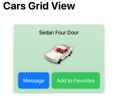
To address this, SwiftUI provides the accessibilityElement(children: .combine) modifier, which combines child elements into a single accessibility element. By applying this modifier to a container view that encompasses all child elements, you can create a cohesive accessibility experience for VoiceOver users.
struct CarGridItem: View {
    let car: Car

    var body: some View {
        VStack {
            Text(verbatim: car.name).padding(.top)

            Image(decorative: car.imageName)

            HStack {
                Button(action: {}, label: {
                    Text("Message")
                })

                Button(action: {}, label: {
                    Text("Add to Favorites")
                })
            }
            .padding(.horizontal)
            .padding(.bottom)
        }
        .accessibilityElement(children: .combine) // Group child elements
    }
}
In this example, the CarGridItem view represents a single card within the grid view. By applying the accessibilityElement(children: .combine) modifier to the VStack container, all child elements (text, image, and buttons) are grouped together as one accessibility element. This ensures that VoiceOver users perceive each card as a cohesive unit, with the card's name and associated actions presented together.
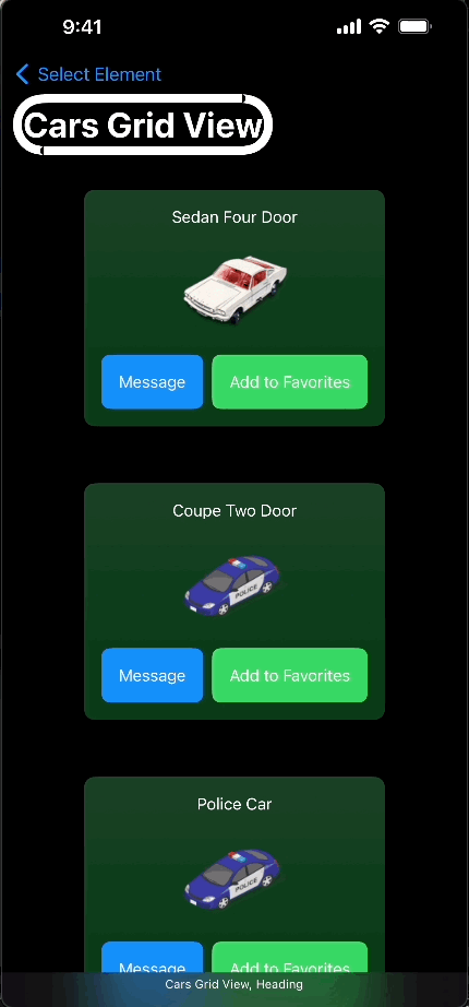
Demo video (Grouping):
#8 — Managing Accessibility Sort Priority:
Managing accessibility sort priority enables developers to control the order in which VoiceOver traverses elements within a view hierarchy. This feature is particularly useful for views with overlapping content or complex layouts, where the default navigation order may not align with the desired user experience.
To specify the accessibility sort priority for an element, SwiftUI provides the accessibility(sortPriority:) modifier. This modifier allows developers to assign a numeric value to indicate the relative priority of an element compared to other elements in the same view hierarchy.
struct SortPriorityExample: View {
    var body: some View {
        VStack {
            Color.blue
                .frame(width: 200, height: 200)
                .accessibility(label: Text("Blue Square"))
                .accessibility(sortPriority: 1) // Sort order 1 - Reads Third

            Color.red
                .frame(width: 150, height: 150)
                .accessibility(label: Text("Red Square"))
                .accessibility(sortPriority: 2) // Sort order 2 - Reads Second

            Color.green
                .frame(width: 100, height: 100)
                .accessibility(label: Text("Green Square"))
                .accessibility(sortPriority: 3) // Sort order 3 - Reads First
        }
    }
}
In this example, we have three colored squares stacked vertically within a VStack. Each square is associated with a specific accessibility label and assigned a unique accessibility sort priority. The green square has the highest priority (sort order 3), followed by the red square (sort order 2), and then the blue square (sort order 3).
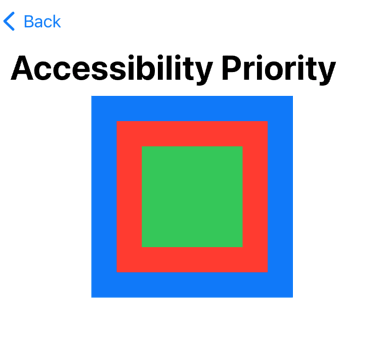
When VoiceOver navigates through the view hierarchy, it prioritizes elements based on their assigned sort priority. This ensures that VoiceOver users receive information in the intended order, improving the clarity and coherence of the accessibility experience.
Demo (Accessibility Priority):
Github Repo:
Also, checkout my other articles on Accessibility:
Sources:
For a deeper understanding of accessibility features beyond the basics, delve into Apple’s Accessibility API documentation:
